
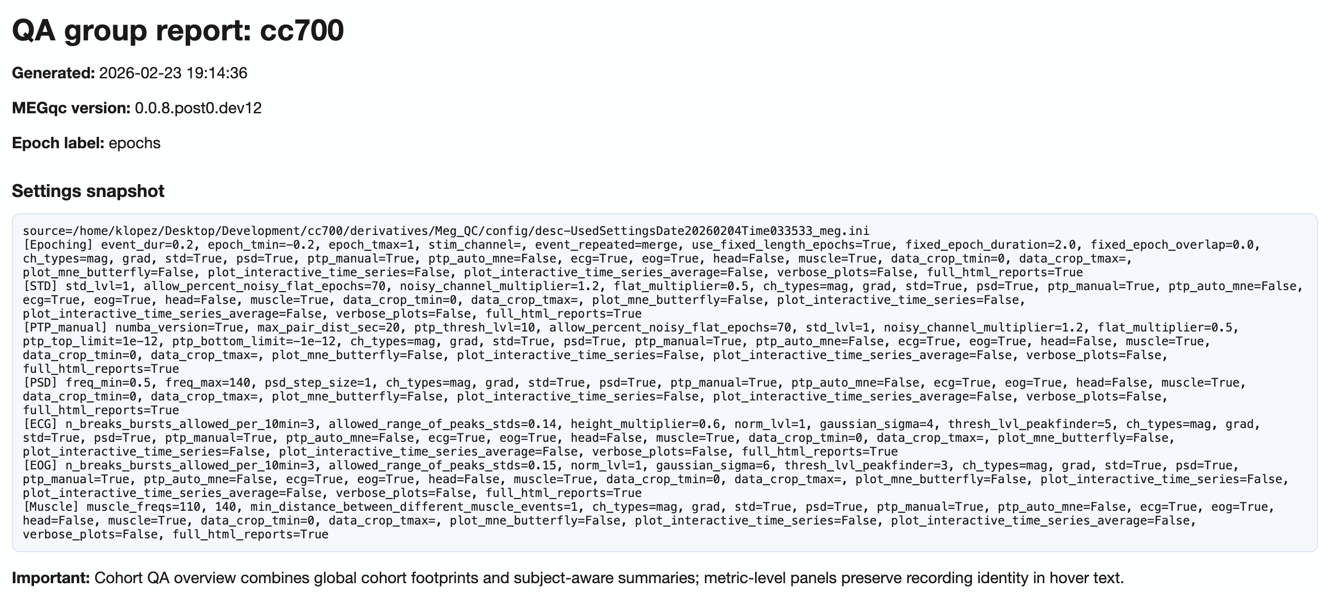
QA Group Report#
QA Group reports aggregate quality assessment metrics across all subjects in a single dataset. They help identify cohort-level patterns, outliers, and task-dependent quality shifts.
For execution instructions, see the Tutorial.
What QA Group Reports Show#
The QA Group report answers the question: “What are the quality patterns across my entire dataset?”
While QA Subject reports focus on individual recordings, QA Group reports reveal:
Dataset-wide metric distributions
Subject and recording outliers
Task/condition-dependent quality differences
Spatial patterns across the sensor array
Navigation Structure#
The QA Group report uses a two-level tab hierarchy:
Top tabs: Combined (mag+grad) | MAG | GRAD
  └── Section tabs:
      ├── Summary distributions
      ├── Cohort QA overview
      ├── QA metrics across tasks
      ├── QA metrics details
      └── Cumulative distributions

Top-Level Channel Type Tabs#
Tab |
Content |
|---|---|
|
Pooled view across all channel types (use with caution due to unit mixing) |
|
Magnetometer-specific analysis (units: pT) |
|
Gradiometer-specific analysis (units: pT/m) |
Section 1: Summary Distributions#
This section provides quick statistical overviews of each metric across all recordings.
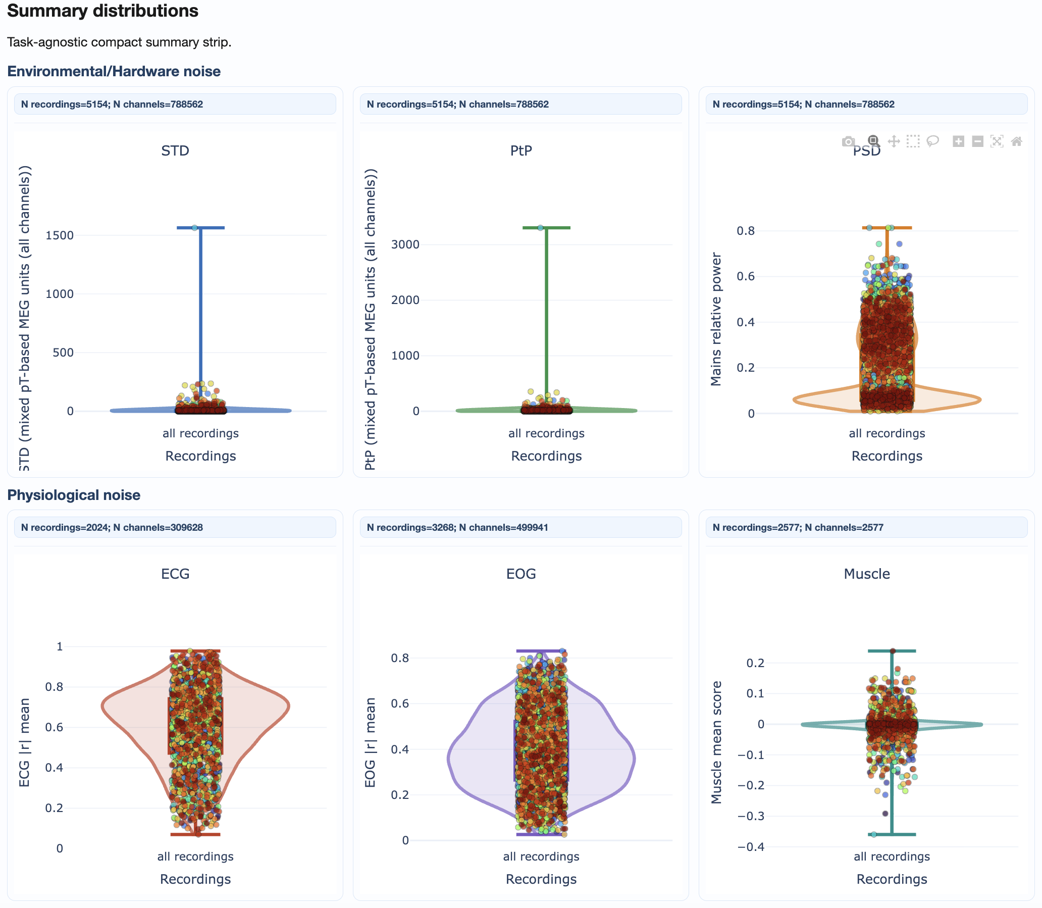
What you’ll see:
Violin plots: Show full distribution shape for each metric
Box plots: Highlight median, quartiles, and outliers
Individual points: Each recording plotted for identification
How to interpret:
Wide distributions suggest high variability across recordings
Outlier points above/below whiskers may need individual inspection
Compare MAG vs GRAD tabs for sensor-type-specific patterns
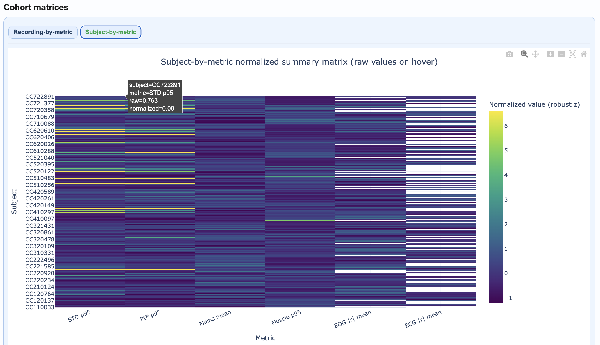
Section 2: Cohort QA Overview#
This section provides integrated cohort summaries for quick triage.
Components:
Recording-by-Metric Heatmap#
Rows = recordings, columns = metrics
Color = normalized burden (dark = higher burden)
Hover for raw values
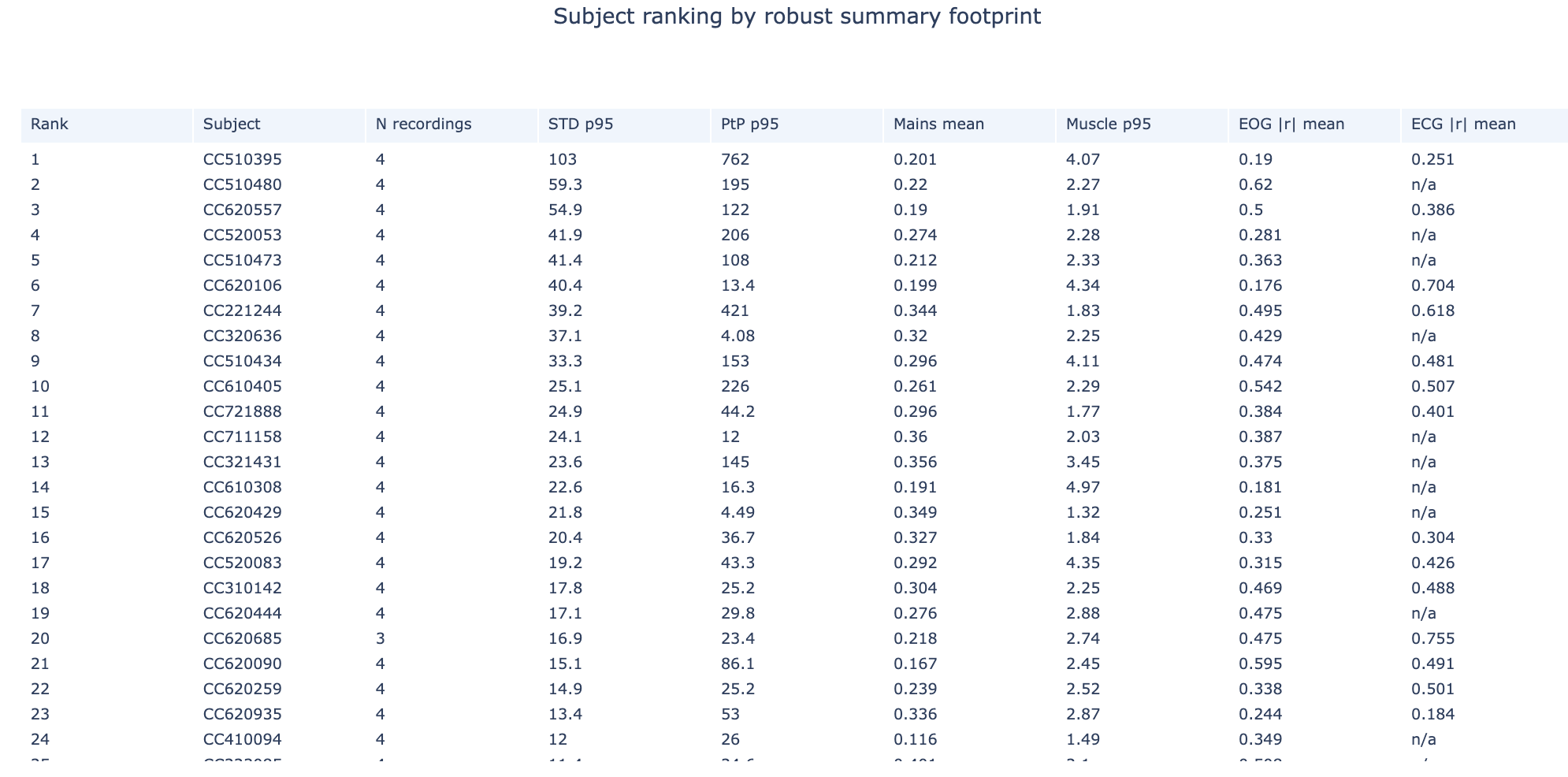
Subject Ranking Table#
Subjects ranked by aggregated quality footprint
Higher rank = more quality issues
Click to identify problematic subjects
Top Subject Epoch Profiles#
Small multiples showing epoch-wise patterns for highest-burden subjects
Quickly identify temporal patterns in problematic recordings
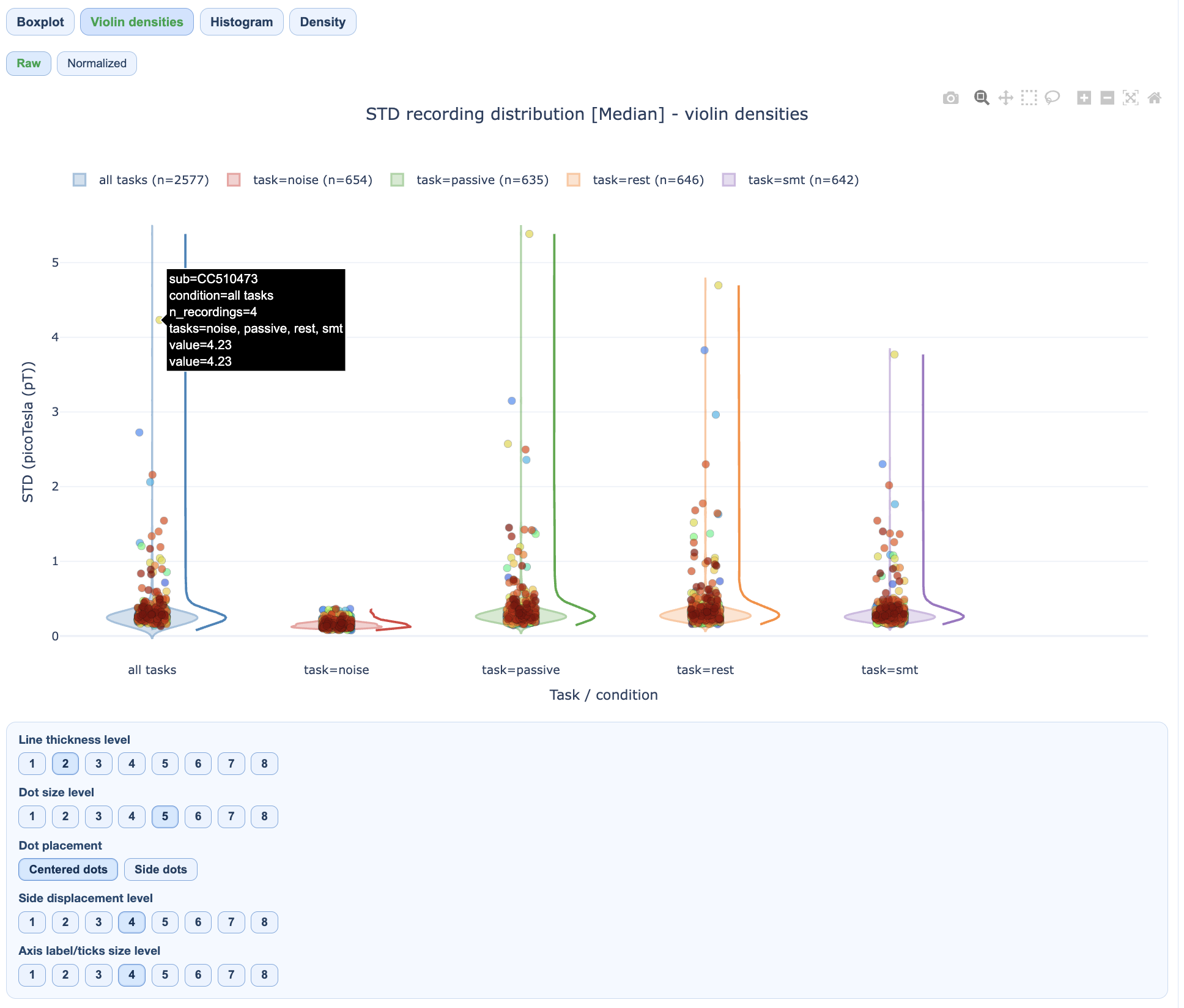
Section 3: QA Metrics Across Tasks#
This section reveals how quality varies by task or experimental condition.
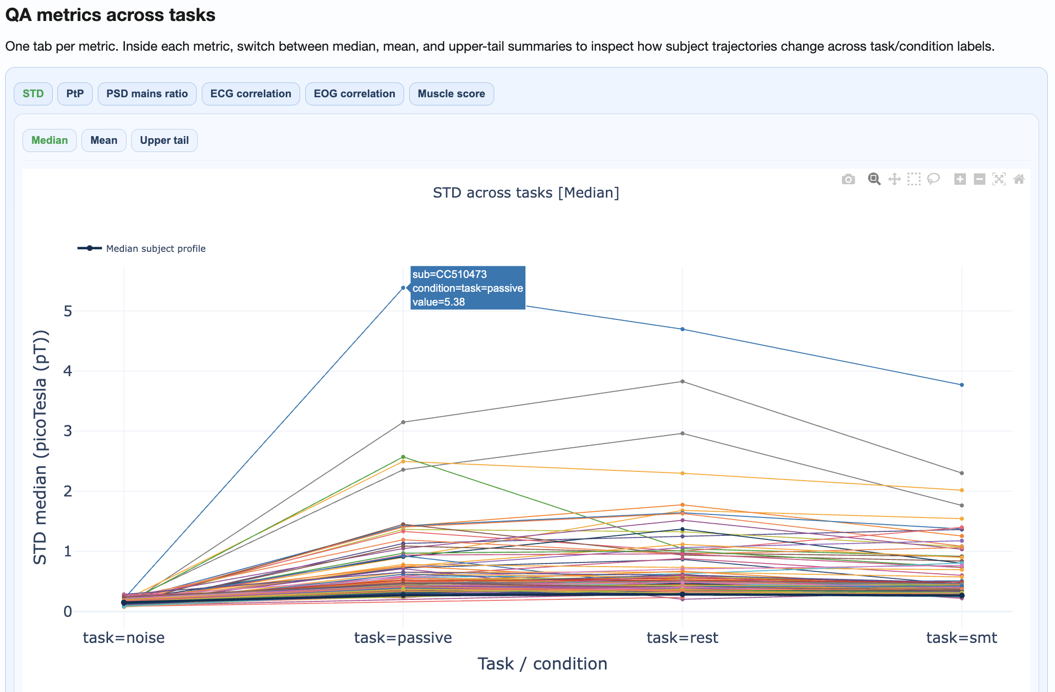
What you’ll see:
Separate distributions per task/condition
Subject trajectories connecting the same subject across conditions
Statistical comparison of condition effects
How to interpret:
Parallel trajectories suggest consistent within-subject patterns
Crossing trajectories suggest condition-specific effects
Large between-condition shifts may indicate task-related artifacts
Section 4: QA Metrics Details#
This section provides deep-dive visualizations for each metric.
Available views per metric:#
Metric |
Views |
|---|---|
STD |
Distributions, fingerprint scatters, channel×epoch heatmaps, topomaps |
PtP |
Distributions, fingerprint scatters, channel×epoch heatmaps, topomaps |
PSD |
Frequency burden distributions, mains ratio distributions |
ECG/EOG |
Correlation burden distributions, topomaps |
Muscle |
Event burden distributions |
Channel×Epoch Heatmaps#
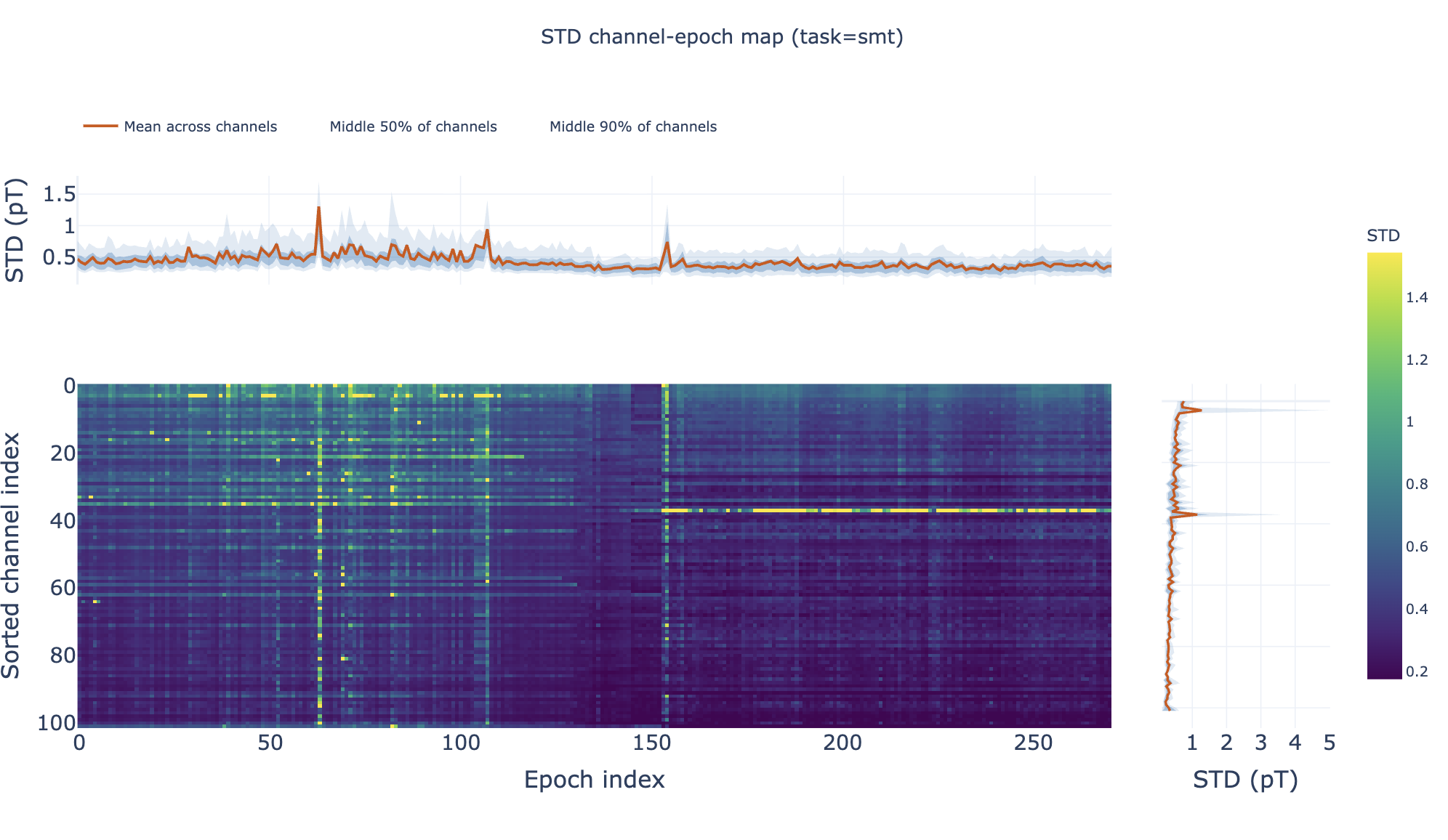
These heatmaps aggregate channel×epoch patterns across subjects:
Rows = channels, columns = epochs
Color = metric value
Top profile = epoch summary, right profile = channel summary
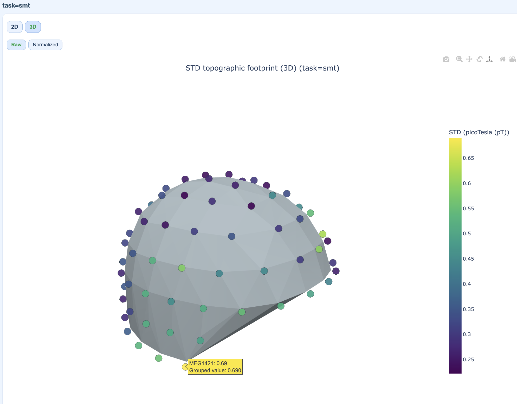
Pooled Topomaps#
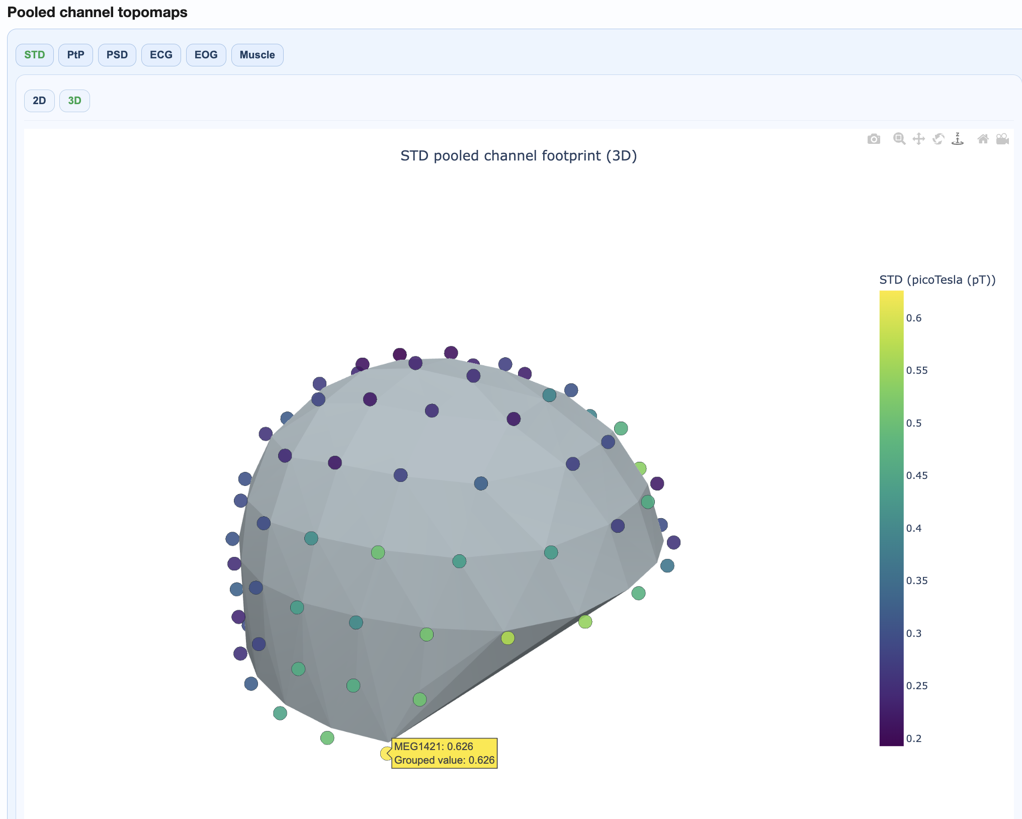
Sensor-space visualizations showing where quality issues concentrate:
2D flat topomaps for quick viewing
3D interactive topomaps for detailed exploration
PSD Frequency Views#
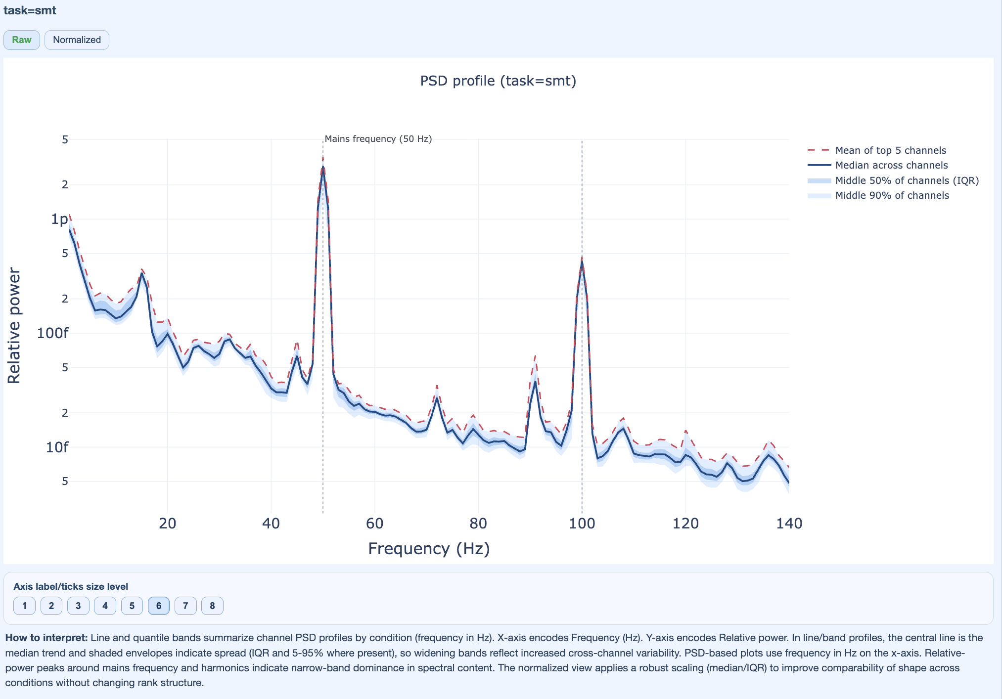
Show spectral patterns across the cohort:
Mains frequency burden
Harmonic patterns
Broadband contamination
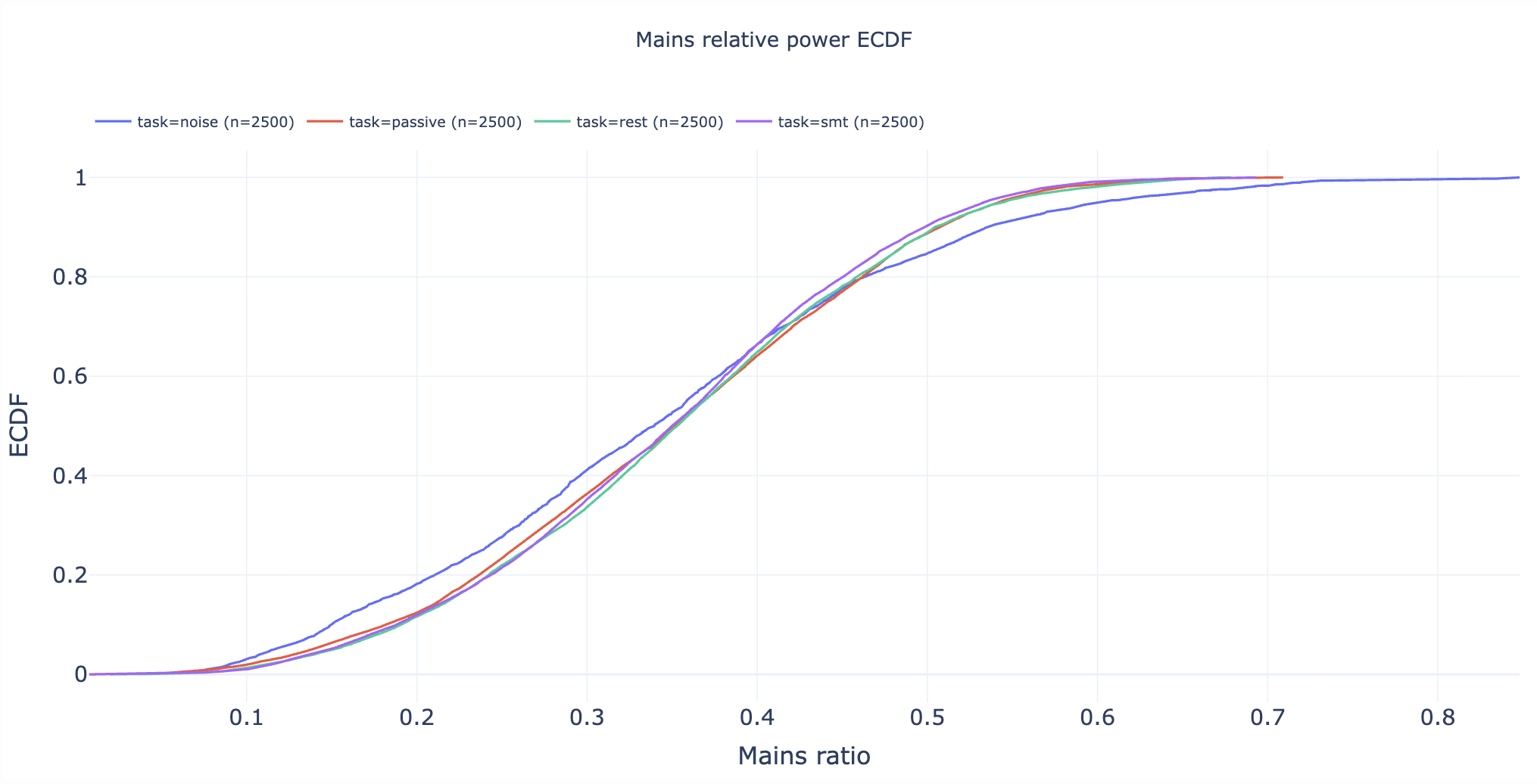
Section 5: Cumulative Distributions#
Statistical appendix with empirical cumulative distribution functions (ECDFs).
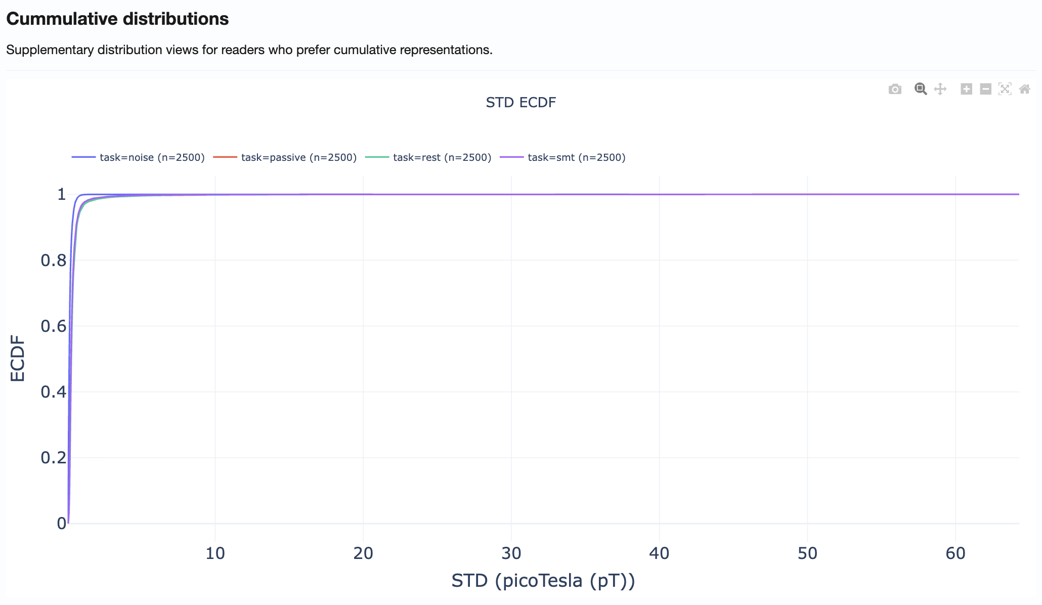
How to use:
Compare distribution tails across metrics
Identify what percentage of recordings exceed specific thresholds
Support threshold selection for QC decisions
Practical Reading Order#
Start in Summary Distributions → Get quick overview of metric spreads
Move to Cohort QA Overview → Identify outlier subjects/recordings
Check QA Metrics Across Tasks → Test for task-dependent patterns
Use QA Metrics Details → Explain observed outliers with detailed views
Use Cumulative Distributions → Support threshold decisions
Tips for Effective Use#
Always compare MAG and GRAD tabs when investigating issues
Use hover information to identify specific subjects/recordings
Cross-reference with QA Subject reports for detailed inspection of flagged recordings
Document findings before proceeding to QC Group analysis